Skip to content
What makes it readable, clickable, and valuable?
If you are authoring e-newsletters for business, I expect you are doing so for a valid business purpose and not the immense glory of being a “published writer.” Valid purposes might include having a recipient act upon some of the content, perhaps by clicking on a link to get more information on a product or service. The reader could also be led to a place where the chances of turning them into a paying customer are enhanced. A “Sales Funnel” environment that massages all the right spots seeks to ease that reader into reaching for a credit card and clicking “Buy Now.” This “conversion” may or may not take place immediately, or even at all, but the wise assembly of your e-newsletter design elements most certainly have an impact on the chances of success. I would suggest the best “story” begins before you type the first word in that e-newsletter.
Sculpting a Good First Impression
 “Dress for success!” Is it really that easy?
Personally, I’d start with “Shower for power!” It’s no use dressing up in a business suit and having perfect hair, a perfect face, and snow-white teeth if you walk into a meeting smelling like an unbathed animal. Dr. Jonas Olofsson, co-author of research from Stockholm University and the Swedish Collegium for Advanced Study, published findings in the Royal Society Open Science journal that suggest being clean even has a link to survival.
“We think that olfaction might be at the root of the pathogen detection system, so body odour disgust might be the most primitive, most fundamental way to detect pathogens,” he said.
That! Company is the word leader in White Label Digital Marketing. We deliver results for agencies large and small world-wide. Get answers to the question:What is White Label? and more about the services we provide. We can help you achieve the results you deserve today!
I would propose a similar reaction may be hard-wired in humans when seeing (not smelling) an e-newsletter. If it looks so poorly assembled that you don’t know where to start, if it has more colors than a carnival spin ride and nearly all the type fonts, sizes, and styles available in Microsoft Publisher—you should instinctively run for your life!
Well, you should at least not waste your time trying to read it.

Do We Train Our Eye to Know What Design Elements in E-Newsletters Are Good vs. Bad?
Partly, yes. We do “train ourselves” to recognize good design elements from bad—but not in a physical sense, at first. The eyes will eventually work in unison with the brain and issue feedback that will guide our appreciation of design, but initially, we may need feedback from other eyes. Having an unbiased (and candid) partner to observe our work and offer feedback is a simple step to take. The problem often is, your partner may have no clue what effective e-newsletter design elements are. Worse, they could have ideas that punish the product even beyond your own nascent abilities.
What, then, is one to do if feedback is so risky? Examine an old, trusted method of learning: a book, a class, or an online guide of a higher quality than this! Kidding aside, you can develop tangible skills in a short period of time by studying the basics of design. I became a typeface snob virtually overnight after taking a one-day “Layout & Design” class years ago. Learning how not to mix certain font styles in a document made me an instant force to be reckoned with in the office (okay, there were only five others—but I knew what I was doing!).
After practicing some of the “basics” and getting feedback from trained eyes you can trust, you may find yourself searching for more artistic e-newsletter design elements to assign to your work.
A voice may whisper to you, “Don’t overdo it. Stay conservative.” Another voice may respond, “There are so many new typefaces and styles, don’t be like all the others!” Before you wonder if a dose of antipsychotic meds were missed, let’s soberly consider these two options.
Is Space the Final Frontier in e-Newsletter Design Elements?
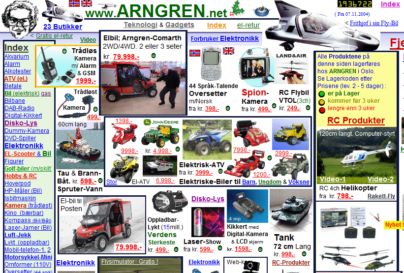
 In a quest for impact, uniqueness, artistic flair—call it whatever you want—the victim is often space. In design, we say “White Space” or “Negative Space.” In White Space, there is no content. No bold text or colored clip art. No heavy lines or alternating puppy and kitten faces in a neat little row to spotlight Adopt a Pet Day. White Space is just that, and it has a name because it really is that precious. Show me a bad e-newsletter and most often I will show you very little White Space. There are other bad design examples, but the space that has nothing in it usually falls to the amateur publisher like an empty corner in Manhattan does to a hot dog vendor. To some, it just cannot be preserved, and it is substituted with last-minute notices, images, phone numbers, or other call-outs that could have been placed elsewhere for the sake of visual sanity.
White Space does not need to be white. It is found in an assortment of places, some obvious and others, more subtly preserved. A short list of examples are below:
- between columns of text (column gutter)
- on the edges of pages (margins)
- at tops and bottoms of pages (head and foot)
- around images (text wrapping padding)
- between lines of text (leading, pronounced “ledding”)
- between adjacent characters of text (kerning)
- between paragraphs of text
If there is any doubt of the value to maintaining White Space, an honest appeal to the poetry written around us in other scenes of life should inspire confidence. Ask yourself:
- Does wearing more makeup on a face always make it prettier?
- Does dressing in a multitude of colors and patterns at one time amount to a better look?
- Does a recipe with every seasoning in one’s cabinet taste better than a simple, 4-ingredient dish?
- Does speaking faster without pause make for a more satisfying conversation (for both parties)?
- Is filling a living room with heavy furniture, tables, bookcases, covered windows, lamps, and 300 collectible figurines making it a room worth living in?
The familiar question is: Is more better? In e-publishing, we have the opportunity to define our own size boundaries, so there is no reason we cannot offer a reader the space to savor our wonderful content in a peaceful, relaxed way. A vacation on a quiet beach with warm ripples of water gently lapping up the shoreline. Water, sand, and sky, versus being handcuffed to a pole in the middle of Times Square at midday where chaos and input overload prevail.
Easy on the Eye
White Space provides relief to the reader’s eyes. We are moving into the physical realm here, so hang on. Forget about content for now. Our brain will process information more efficiently if it is presented clearly, and “clearly” happens when our eyes can travel in ways that are familiar to western language readers. Typically, this means top-down and left-to-right. If a page is filled with boxes or heavy bold type meant to draw attention (to places in an unnatural order), it makes us work harder to consume the information because our eyes will bounce like a ping-pong ball across the page.
Psychologically, I would propose the lack of White Space suggests a lack of confidence in the messenger. The one in a conversation who only hears himself, talking a little too loudly about all his own accomplishments or experiences, not taking a moment to let you respond. Meanwhile, the designer who respects the value of White Space is relaxed, sitting reclined in a soft, cozy chair, sipping a tall glass of iced jasmine tea saying, “Welcome to my pad. Be chilled and enjoy, my friend.”
Yeah, I choose the latter.
Still, some visual learning might be helpful in defining the good use of e-newsletter design elements, and below are two examples of website layout philosophies from alternate universes.

There are a vast range of topics upon which a publisher of e-content may linger when in search of optimal e-newsletter design elements. White Space is an important beginning. The understanding of it and appreciation of its inclusion in your publications will earn you immediate respect, and more importantly, readers. In future posts, we will study other design concepts and styles that could be included in your toolbox.
Written by: Jay Wiencko