Skip to content

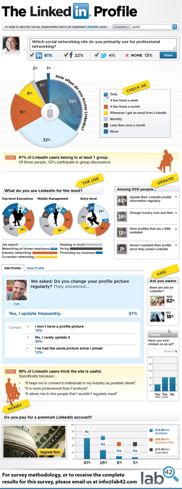
 Last March, LinkedIn hit the 100 million user mark. This accomplishment made LinkedIn even more powerful for finding a job, staying in touch with friends and colleagues, and promoting resumes. LinkedIn is gaining a new user every second, and it is evident from the site’s steady growth that it has become a very useful networking tool.
Researchers at Lab 42 were curious to how many people were actually using this fast growing site. Lab 42 asked 500 LinkedIn users about how they use the site and compile the data into a graphic. How are you represented by the pie charts and polls? Do you think it’s accurate?