Skip to content
Part 1: Visual Identity
It’s always a good idea to periodically evaluate the visual aspect of your website. A good way to do this is to search for your website and enter the site with the mindset of a stranger. Your landing page is the first visual impression of your company the consumer has. It can really make or break the session as well as the potential relationship between you and the consumer. What kind of impression do you want to have on potential consumers or clients, and how do you realistically think this differs from the image that you are actually portraying? If you were to objectively look at your website, how does your attitude shift from page to page? Do any particular visual elements look slightly off or out of place? What do the colors say to you? The first step to recovery is admitting you have a problem.
Next, research your competitors and identify what kind of visual presence they have. Do they take a more minimalistic approach, or do they have pages brimming with information? Take note of visual elements they do well and why you believe they work.
Fonts
Fonts really set the mood for what kind of information is going to be shared. Longer paragraphs are usually in serif fonts because the distinctive “feet” on each of the letters can make it easier to read at a more rapid pace. Serifs typically seem more condensed and uniform to me and make for great copy fonts. San serif fonts have the generality of being more open and modern and can sometimes appear to contain more white space. The stereotypical connotations can either harm you or help you when choosing fonts for websites. You would want all the fonts to look like they have the same aesthetic whether or not they are from the same font family.
I would personally choose a more distinctive font for H1 tags as they have a bigger font size and are displayed more prominently on the page. For the higher header tags, I would choose variations of the same font as H2-H6. Then for the paragraph font I would choose a font that encourages a high rate of readership and is extremely legible.
That! Company provides captivating and effective web design services for agencies world-wide. Learn More about our White Label Web Design Services and how we can help you and your clients create or improve their web presence. Get started today!
If your paragraphs look clustered and hard to read, your visitors will quickly find another site that isn’t. Additionally, choose a font that would appeal to your target audience and stay consistent with your brand in the sense of professionalism. Banking and government websites will generally not have the same freedom of expression as a website for dog groomers or a hipster cold brew start-up. Swipe through a few pages of Google fonts and see how completely different fonts can look from each other with seemingly minor differences. You can also experiment with custom phrases and font sizes if you wanted to get a bigger picture. Some of my favorite fonts include Lobster, Crimson Text, and Raleway.
When you are looking through the font choices, take note of all of the fonts that remind you of book covers, business logos, or advertisements. Brand recognition is a powerful tool that many people don’t realize encompasses a brand’s visual identity. Brands can be recognized not only by their specialized logos, but also from their fonts and typical colors. For example, the Amatic SC font reminds me of the houseware brand Rae Dunn, the Optima font is reminiscent of the Aston Martin logo, and the Freckle Face font looks like the fonts used in SpongeBob SquarePants.

Colors
Are you trustworthy? Are you an aggressive competitor? Do you care about the planet? I can tell within 30 seconds of looking at your website what kind of direction you are trying to go in. Color theory is a powerful tool that is important to consider in design. It is even shown in the Disney movie Inside Out where all of the characters that portray emotions are various shades of their associated color. The character Sadness is varying shades of blue, Disgust is green with a hint of purple, and Anger is red.
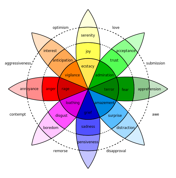
The intensity of the emotions, as shown in Robert Plutchik’s Wheel of Emotions, increases with the intensity of the color from annoyance at light red to rage in that deep burnt red. These color to attitude connections have been used and abused by businesses and are very commonly identified today.
A great pictorial example is this infographic from ConceptDrop’s blog that has the seven main colors used in business logos and advertising:
![]()
A sleek black and silver colorway can translate to a luxurious leather sports car from the likes of Lexus or Mercedes. A fresh, earthy green breathes life and ecological balance into Whole Foods’ and Tropicana’s branding. A goofy and playful orange personifies Nickelodeon and Crush beverages. That trustworthy and friendly Lowe’s will always help you with your home improvement needs. The dependable and secure IBM gives you peace of mind with their traditional respectability.
Once you have your ideal color family, then a specific shade can be chosen:
- Light or Dark? Is it a casual, light, and airy feel or is it a deeper, more mature environment?
- Vibrant or muted? Are you in your audience’s face, assertive? Or are you more muted? This can mean more refined or can make a color have a lighter feel even when it is a darker shade.
- Cool toned or warm toned? This slight difference can change connotations.
- Is this color going to be more of a primary focus or a subtle accent?
All emotions can be created and/or enhanced by your branding colors. In any successful company’s branding materials, a true sense of direction and attitude can be visualized within the first 10 seconds of impression. For example, Panera Bread’s logo and coloring to the inexperienced eye might just seem like a green and a brown. To me, however, I see a deep, comforting warm-toned hunter green and a relaxed, yet chic beige that in combination equal a casual, cozy atmosphere. When applied to their menu selections, they have heavily marketed their newly completely clean menu as well as their freshly baked bread: a not-so-simple green and a not-so simple brown.
Style Guides
An integral part of a cohesive and visually appealing website design is the inclusion of a style guide in order to maintain a singular direction for the website.
The style guide will include:
- H1-H6: font, font size, hex code
- Page hex codes
- Adjectives: how do you want your target audience to feel when they are visiting your site?
- Trendy?
- Professional?
- Playful?
- Quaint?
- Aesthetics:
- Textures
- Mood pictures
- Background images
A sample of a simplistic style guide I have created can be found here. It is a great idea to create a visual style guide like this in order to have an idea of how the colors, textures, fonts, and images will look together. It is important that all elements are going in the same aesthetic direction. The ideal direction of the site will be cohesive and envelop the target audience in a particular feeling or attitude and therefore can add to the experience the consumer has with your brand.
White space
White space is a very important element of a website because it indicates how cluttered or sparse a website looks. Typically, websites with very little white space can feel cluttered and/or overwhelming for visitors, especially when it is a landing page. There should be a healthy balance but leaning more toward a higher amount of white space. The pages should be easily navigable as well as readable so visitors can easily find their answers, or where their answers might be on any page they visit. When there is an overwhelming amount of information as well as images and moving elements, it can definitely scare visitors away from the website simply because they don’t want to take the time to try to find their answer like the proverbial needle in a haystack.
Written By: Kelly Peretz