Skip to content
Can we all get along?
In no way does e-newsletter layout and design have the significance or weight of the following historical reference. However, the memory for this writer of a certain quote was so poignant, it is unforgettable. The fact that choices in typography bear some momentary parallel is coincidental, and any offense is unintended. Opposing opinions notwithstanding, the memory is also a part of American history, and for the following few paragraphs, I will take liberty to share this chapter as it resides within my recollection.
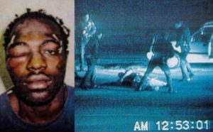 On April 29, 1992, at the conclusion of a seventh day of deliberations, it seemed a nation was holding its collective breath. Four Los Angeles police officers had been charged with assault and using excessive force during the arrest of a man who had fled at high speeds in a vehicle. The images of the arrest portrayed a violent beatdown on a man who was unarmed but noncompliant. It was captured on video by an onlooker and shared repeatedly on national news. The ensuing weeks of exposure painted a picture that made it difficult to believe anything other than a conviction of the arresting officers was assured.
Seemingly against all odds, the jury acquitted all four officers of assault. Three of the four officers were acquitted on use of excessive force. The fourth excessive force charge failed to reach a verdict.
In just hours after the announcement of the verdicts, the “1992 Los Angeles riots” began. It lasted six days but felt like a civil war. The nightly images of rioting in the streets included African Americans who were outraged by the verdicts, and regrettably, the killing of many innocent people. It was immeasurably sad. The division expressed between races was widening by the minute. It took police, the California Army National Guard, the United States Army, and the United States Marine Corps to restore order.
That! Company is the word leader in White Label Digital Marketing. We deliver results for agencies large and small world-wide. Learn more about our White Label Services and what we can do for you. We can help you achieve the results you deserve today!
On May 1, 1992, just a few days into the rioting, Mr. Rodney King , himself deeply troubled by the ensuing violence, made statements in a television appearance where he appealed for peace and calm:
“I just want to say – you know – can we all get along? Can we, can we get along?”

The e-Newsletter Typeface Family Reunion
Now, on to the issue of typeface families. The question is, can they all get along? The truth is, not really. As in life, some families are tight—they get together on every holiday and pull together in times of need. There is no apparent weakness when they stand as one.
Other families defy the very term itself. They are completely and constantly incongruent with each other. One says “true” while the other says “false.” One wears a suit with neat hair and polished shoes, the other is in ripped jeans, dreads, and is inked from cuff to collar. That’s life.
In layout design, we have so many tools. Shapes, colors, images, and typefaces are just the beginning. Getting the tools to work together is a commendable goal. Some of the effort requires experience, an eye for design that comes with good instruction, feedback, and practice. Thankfully, some of the journey can be traversed by simply reading proven design “truths” you can take to the bank.
What Am I to Do with All the Typefaces?
Let’s break the subject of typefaces down a bit. Do names like “Helvetica, Times New Roman, Arial” sound familiar? Good. Those are called “typefaces” in the layout world. Contrary to popular (misinformed) opinion, a “font” is a particular style, of or applied to, a typeface.
We have a few major categories to start with, and that will help us identify them in use throughout our design life. The categories have to do with some basic design elements of each character within a typeface. We’re talking, “How does the L, T, R and G look?”
If you look carefully, you will see differences, some subtle and some obvious.

Serif – Characters have small angles or small strokes at the ends of a primary stroke. Typically found at the foot of a character or top. Examples include Times, Palatino, Bookman, and Goudy. Strengths: good body text. Weaknesses: inconsistent quality when italicized and bold.

Sans Serif – Typefaces that do not have the serif. “Sans” is French, meaning “without.” Examples include Gill Sans, Arial, Eras, and Impact. Strengths: excellent headliner visibility, emphasis. Weaknesses: can be page-heavy in large quantity.

Script – Similar to cursive handwriting, with characters that feature curved strokes and many times at an angle other than perfectly vertical. Examples include Brush Script, Edwardian Script, and Freestyle Script. Strengths: inherent ability to deftly convey formal or casual tone, natural handwritten look. Weaknesses: often overused, difficult to read in longer runs.
Blended Families Pose Difficulties
Let’s begin with one easy rule: Do not mix multiple typefaces of the same category on the same page.
You may like Gill Sans and Eras equally but deciding to use them both on a single page will not make your readers happy. Pick one and stick with it for a page, a booklet, or brochure. Longer publications may accommodate multiple typefaces within the same category, but it would not be an example of advanced design techniques. Restraint is respected while excess is usually regrettable.
The second rule: Blending typefaces from different categories is a good technique for most publications.
The use of a sans serif as a header (i.e., Eras Bold) and serif type (i.e., Goudy) as the body of text is a long-standing practice, and you can’t go wrong following this recipe. This is not a dismissal of a sans serif occupying a page of body text. It can be quite readable if sized and balanced properly.
 A header needs to stand out and catch the eye, and a bold or semi-bold version of a sans serif typeface will get the job done without the visual distraction of little wedges at the ends of strokes. However, be careful to consider the weight of the header versus the body. A huge imbalance can make it difficult for a reader to move down and focus on the story if the header is so much “louder” than the body typeface.
Is this “rule” ever broken? Well, yes, it is. But the practice is not as common, and the same balance between header and body is important to follow. Generally, headers are bolder and larger than the body, but there are fine examples where this is overruled. Artistic prerogative takes precedent in some “design-heavy” publications that demonstrate where “rules” are challenged and even subordinated. By and large, however, the best practice is a contrast of the two, shown below in both good and bad examples.
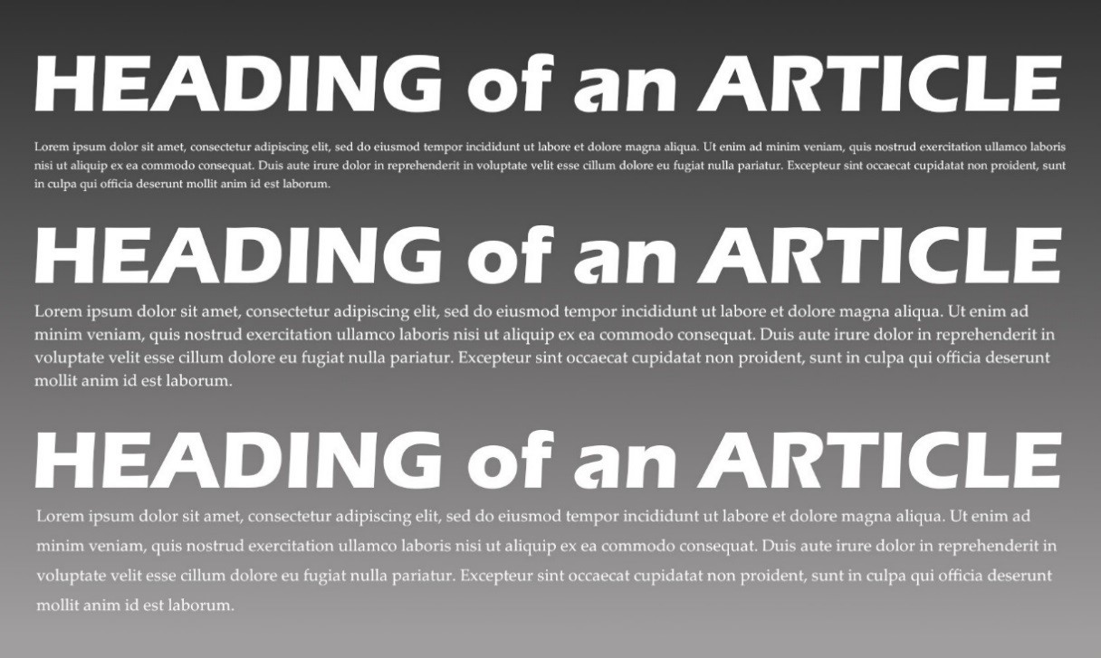
ABOVE:
- The top example exhibits an imbalance of the type size, avoided unless stylistically desired. The header can easily overwhelm the body text and make it hard to read.
- The middle example shows a good balance of size between header in sans serif and body text in serif.
- The bottom example illustrates manually oversized line spacing, called leading. Used with restraint, this can create more white space and ease of reading in subheadings but can become difficult to read over an entire page.
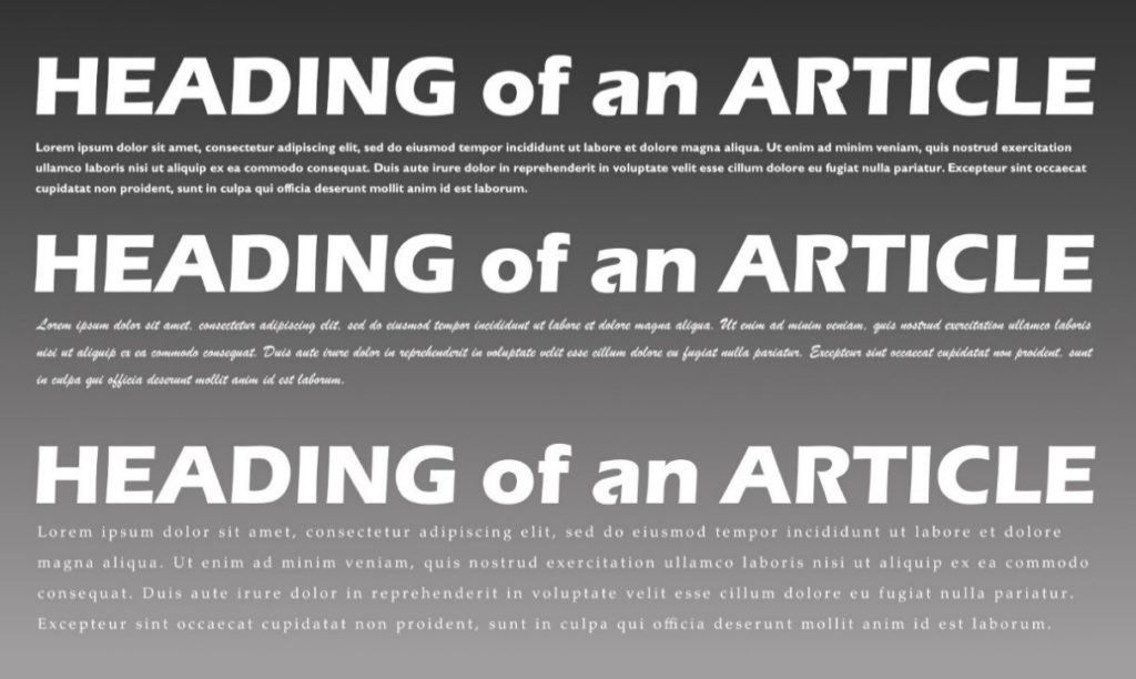
ABOVE:
- The top example shows header and body typefaces as sans serif, but different families (Eras, Gill Sans, respectively). They are too close in appearance to provide contrast, and sans serif is generally not quite as easy to ready in body text as serif.
- The middle example is an example of a bad choice. Mixing script with a sans serif header—even using a script typeface as a body text—is bad news.
- The last example is one of good intent, but poor execution. Often, when designers find new tools to modify the look of their text, they cannot resist trying them out. The expression, “Too much salt spoils the broth” applies here. The leading is acceptable, but when combines with extra character spacing (called kerning), it becomes a chore to read after just a line or two.
Color Me Beautiful
The choice of applying color to text is a personal one, but like all subjective endeavors, it can be judged harshly. Use care and reason when considering colors. Consider headers or “pull text” blocks (the text within quotes that are enlarged and placed in its own article, to emphasize a point) as opportunities to use color. Like typeface families, try to limit the number of colors used in a single piece. You may wish to use shades of one color and black for the body text.
A publication ought to be considered in its entirety when setting a stylistic course. A single page is one of many, not an island that is read separately. The “experience” of reading a multiple page document might be more related to holding a magazine than a website or e-pub today, but the concept of whole-body design still exists. Creating a thematic design, where typefaces are consistent in size, weight, style, and color is step one. Maintaining a well-restrained color palette throughout is highly advisable. Even page margins and image placement should be “predictable” from page to page.
Lastly, there is the “surprise.” A treat of discontinuity offered to the reader to create a pause, engagement, and to provoke retention. Often found near the middle of a publication, it is a page or two that break the rules adhered to before and after. Perhaps type size, a new margin setting, or a solid color instead of a 50% opacity screen. This place may be where a bold, new typeface is used—but only here. It is the “Midway” of the carnival, if you will.
Good luck in creating your next e-Newsletter. Typeface families can get along, but they need a good parent with discipline to guide their proper development.
Written by Jay Wiencko