Skip to content
As many internet marketers must know by now, the “new” AdWords is here and there is no more avoiding it. While the new interface is radically different, some of the functions have updated and certain terminology has been changed to improve the experience of using the online advertising service. While there is plenty of irony in making the sometimes-daunting task of using AdWords “simpler” seem so complicated, Google assures us our transfer from old to new needn’t be so hard. The first thing that is immediately visible when one opens the new AdWords for the first time is the entirely new look of the interface of the landing page (Figure 1).
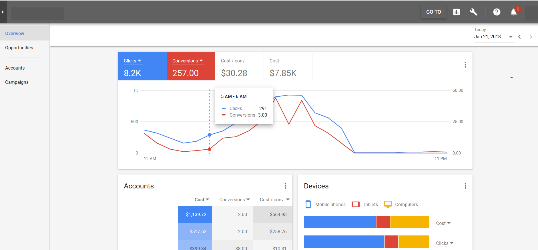
Gone are the text and simple orange & white lists staring at you upon entering the old interface, now you are greeted by primary-toned illustrations. These new charts and diagrams are designed to give simple, intuitive information – or as Google says, “gaining actionable insight” served up immediately upon entering the site. This is indeed helpful if you are used to digging through the previous iterations of AdWords or exporting data from AdWords to other programs to construct bright, colorful charts such as these. Having your information being offered to you in such visually appealing really is a step up. As it will become obvious in this article, for the most part, these charts really are self-explanatory and simply represent like everything else they design and refine, Google’s desire to put everything we need in front of the user without them having to think about it.
Using this new charts and graphs styles, we can make decisions easier and if need be, we can share these images with clients without having to create colorful, easy-to-read graphics in another program. Let’s take a few moments to further examine and explain the components of the landing page charts:
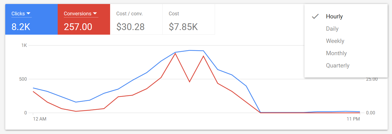
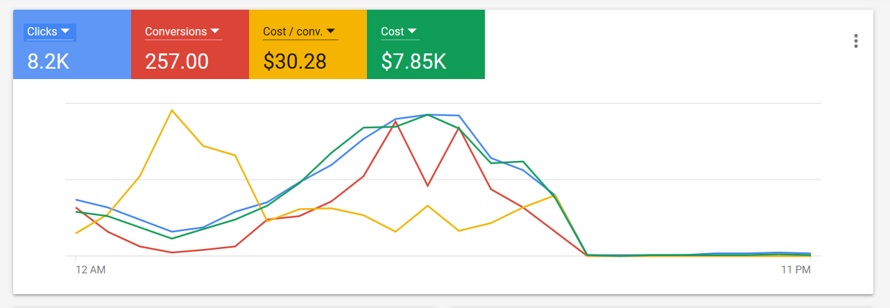
The chart in Figure 2, is featured prominently in the new AdWords and is great if you are wanting to look at the basic metrics of your ads performance at a glance. The graph is customizable to reflect different time ranges.
We are the leader in helping large and small agencies deliver Google Ads Management and other PPC Services to their clients. Can we help you? Check out more about Our White Label PPC Management Services to learn more about what we can do to help you deliver results to your clients today.
The chart can also be set to visually represent different metrics or a combination of all of them if you wish to see the majority of your ads performance with a glance.
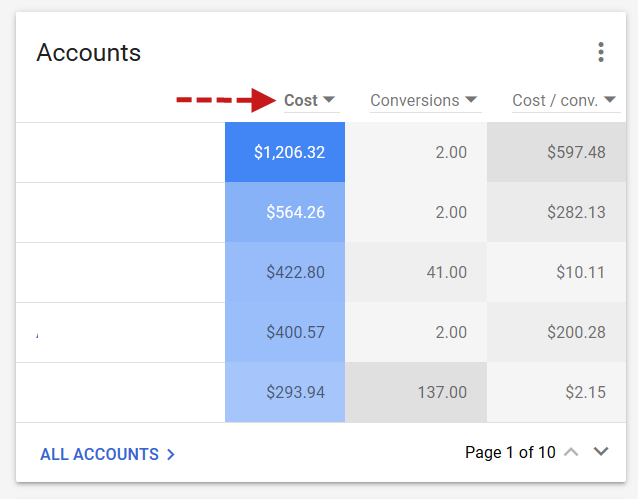
If you need more information at a glance, this Account chart (Figure 5) is available on the new AdWords landing page to accommodate you.

If line graphs are not your thing and you prefer a more chart-based look to your information, your needs are provided for on the landing page of the new AdWords as well. Again, simply by looking at this chart when you first enter AdWords, without investigating, you immediately know how your campaigns are performing. As with the line chart above, by clicking one of the drop-down arrows, you can adjust the chart to show whatever metrics are most important to you.
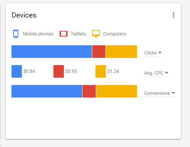
Another important easy to read chart in the new AdWords interface is the device performance (Figure 6). This chart allows us to see campaigns and ads performance amongst devices at a simple glance. Like the other charts mentioned in this article, by clicking on one of the down arrows you are able to change the metrics to any type you wish to see.
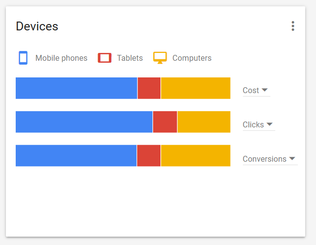
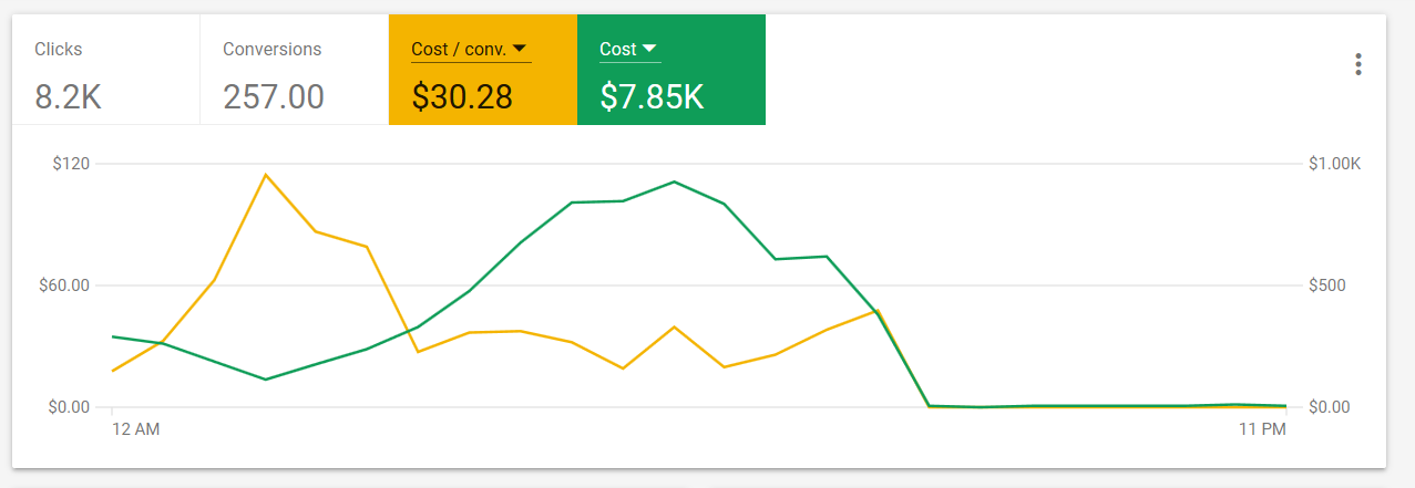
Simply looking at the adjusted Devices chart in Figure 7, visually gives you the information you need to determine if you wish to make bid adjustments on devices to maximize your campaigns reach and performance. Again, if you are not a fan of the line graph that is front and center of the landing page, you can choose to have your information provided to you via a bar graph (Figure 8).
This bar graph in Figure 8 features an hour by hour breakdown of campaign performance. For most AdWords users new and old, this simply seems like a matter of preference. Select your favorite way of looking at data, choose your metrics and there you go! To this point, we have examined and discussed the charts presented on the landing page (Figure 1).
The information given becomes more much detailed and useful once you enter a client’s page.
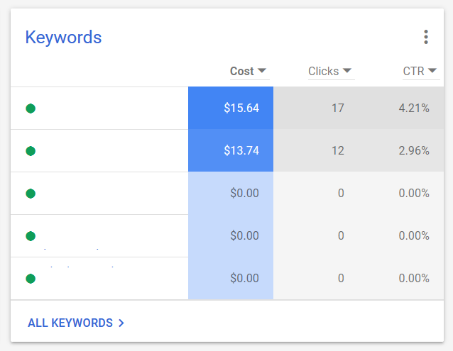

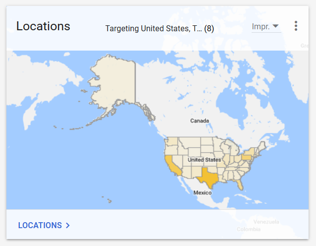
Without opening anything, we can see exactly how our top performing keywords (Figure 9) and ad groups (Figure 10) are doing in a cleaner, easier to read format. At a glance, we know what is working and what is not. Another interesting, simple look at information that was not presented to us by AdWords this way before is locations. By hovering our cursor over any of the states or regions (Figure 11), we can instantly see the information we are looking for without having to go through multiple menus and screens to find a simple list chart that takes more than a moment to read and disseminate information from.
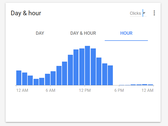
Perhaps one of the most interesting graphics formats used by Google in the new AdWords experience is the heat map utilized by the day & hour chart on a client’s feed (Figure 12). This easy-to-use chart presents a lot of clearly detailed information in a small amount of space. Using different shades of blue, the user can hover over a square to instantly read the metric represented.

In addition to the changes of esthetics and overall feel of AdWords, the seasoned marketing professional must also be aware of extensive features as well. Some important features that can boost ad performance and be unavailable of the prior version of AdWords are:
Audience Manager
- Combines Google Display and Google Search ads remarketing lists into one. You are now able to add audiences from all of Google’s assorted products such as AdWords, Analytics, YouTube and Google Play together to build and refine retargeting lists.
Bid Adjustment for Calls
- AdWords users are now able to pay more or less for the frequency of call information in mobile ads. If you are managing your ads in the new AdWords and want to show your call information more frequently when your ad appears, you will want to raise your mobile bid adjustment. Users and managers can now bid between -90 and +900% on these popular ad extensions.
Content Exclusions
- Marketers and advertisers are now able to decide what content (videos, websites & apps) they don’t want their ads appearing within searches. This feature can help avoid some potentially embarrassing associations of products and web content.
Promotion Extensions
- A new extension only available to users of the new AdWords experience. In addition to being able to call out prices, advertisers are now able to include sale and specials extensions into search ads.
As always, there is expected pushback and time needed to adjust to something new. Google is sweetening the pot for users to jump headfirst into this version of AdWords by offering an enhanced user experience, powerful ways of measuring and displaying metrics and options not available to AdWords users before.
Perhaps the best advice for getting used to the new AdWords is to begin using the format a little and then, once you begin mastering the interface and the new features, start incorporating more of the new AdWords experience into the rest of your campaigns.