Skip to content

As we look through different websites, there are several things at once that need to be done for a white label web development and design. It should look great and make sure the navigation of the website is quite clear. It should hold the audience’s attention within 10-20 seconds since according to a survey, website visitors stay at the website within a maximum of 20 seconds unless there is something that caught their attention. That’s why Color Psychology In Web Design is so important and is the main part of website designing success. A great site structure will gently lead the user down the conversion funnel, silently urging the viewer to take any action to the goal of the site owners.
Color is one of the tools web designers use to improve the user experience. It is one of the ways a designer can help guide a user down the conversion funnel, or subtly nudge the user into buying something.
But is color psychology in web design even needed in a design like that? How does it add to the site? And how does it even work?
In this article, I will be explaining the basics of color theory and how it can help us make better white label web design.
Learning the psychology of color is important for maximizing your website’s web design. Choosing the right colors can help your customers in the frame of mind that urges them to take an action. By getting customer’s attention and provoking the right emotions for sales, color psychology in web design has the power to increase conversions.
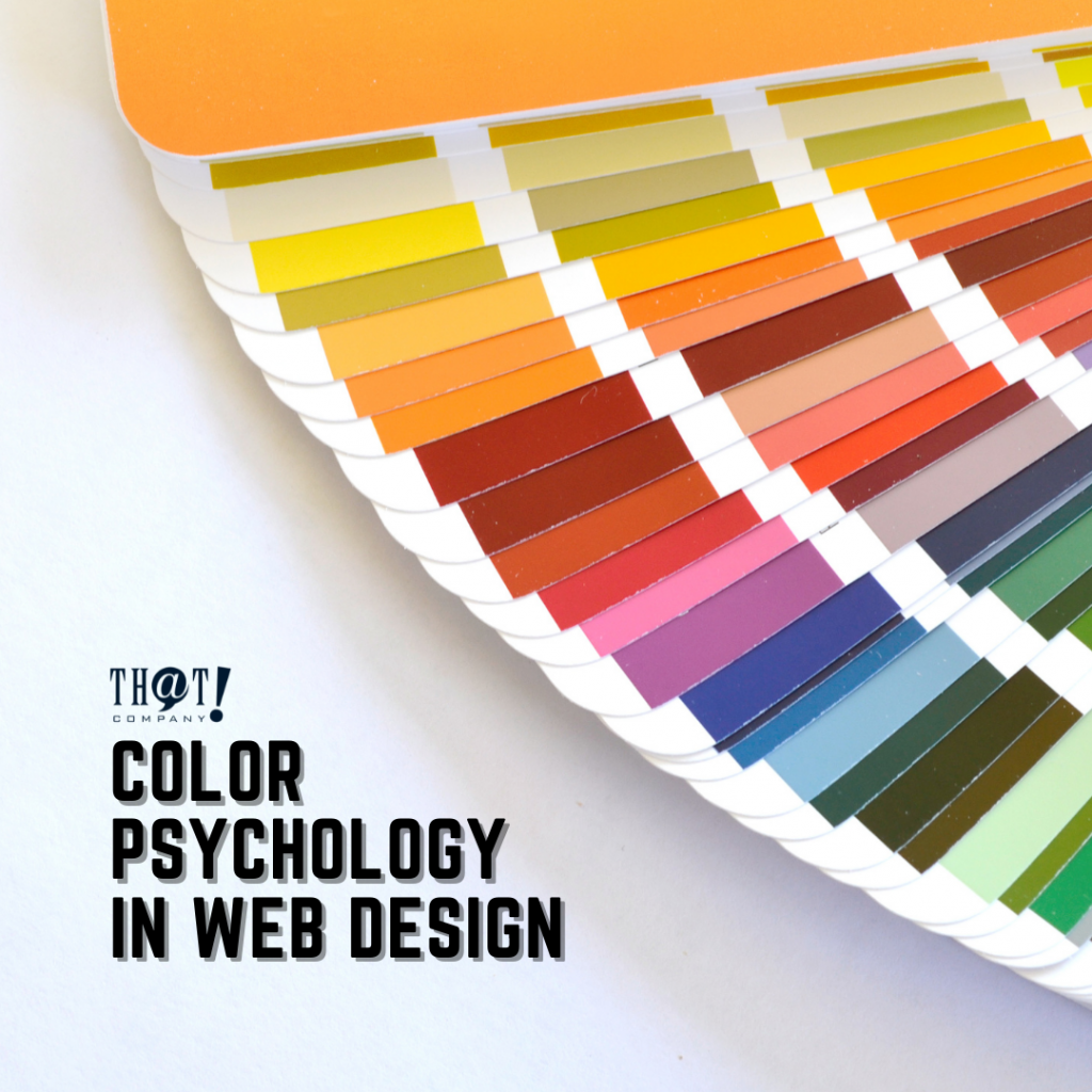
The color wheel is a great place to start in the study of color. It is also one of the most common ways to explain how colors look related to each other. In this picture, you see the standard artist’s color wheel with the 12 main colors. Each one of these colors is made up of a combination of red, blue, and yellow. For example, purple is made up of red and blue, while orange is made up of yellow and red.
Color Psychology In Web Design: Color and Conversions
 It has been proven scientifically that there has been a connection between the color of products and the impulse to buy. Every time you see a color, there’s a chain of reactions occurring within the hypothalamus in your brain. Hormones are released to your thyroid, thus precipitating emotions that influence your behavior.
Factually, 62% to 90% of buying decisions are based on colors! Knowing the color psychology in web design can remarkably enhance elusive conversions for your website.
Where Should I Apply Colors?
Using color psychology in web design may or may not be completely obvious sometimes, but it will make a difference. The key areas that you must be careful about are:
- Call to action
- Primary web banners or hero graphics
- Pop-ops
- Borders
- Headlines
- Background hues
The choice of colors in these important sections depends on the target audience.
[bctt tweet=”Color is one of the tools web designers use to improve the user experience. It is one of the ways a designer can help guide a user down the conversion funnel, or subtly nudge the user into buying something.” username=”ThatCompanycom”]Color Psychology In Web Design: Contrast and Brightness
 Contrast is another significant factor that plays an important role in your website’s readability. Overlapping content with extra bright or dull fonts is a big NO. Your website’s color scheme can affect accessibility and usability. If you make navigation menus and dropdown menus using indistinct colors, it is just as bad as not putting them at all. Thoroughly check your website from the viewpoint of the user and you’ll find out what needs to be done. Based on the color psychology: orange, yellow, red, and blue would usually be the best options.
Brightness is the same as contrast, it takes a significant aspect in the success of your website. It is believed that women prefer soft colors while men prefer brighter colors.
Moreover, the usage of contrast in a website can be used to highlight things on your pages. Nobody would want to purchase a doll that has been drowning in a sea of bright colors.
Contrast is the difference between two or more of the same colors. This is because if you blend different colors side by side, they will look very blended and muddy. Contrast helps lighten up the colors and bring them forward. The brighter the color, the better it can contrast with other brighter colors.
5 Colors from the Internet Marketer’s Perception
 White label digital marketing is a constantly evolving industry, all thanks to the latest technological innovations. There have been many new tools, social media platforms, and resources that are not only effective in placing customers but also in improving marketing skills. One of these tools can be used to customize color psychology in web design. The purpose of colors across different industries has changed over time, with colors evolving into more complex and detailed shades due to the advancements in technology.
The list below of colors and the emotions they trigger and inspire based on color psychology. The proper use of these color psychology in web design can go a long way, providing your website the correct personality for improving conversion rates.
Color psychology in web design suggests that different colors can have an impact on our moods, feelings, and even behaviors. Pink, for example, is thought to be a calming color associated with love, kindness, and femininity.
Many people immediately associate the color with all things feminine and girly. It might also bring to mind romance and holidays such as Valentine’s Day. Some shades of pale pink are described as relaxing, while very bright, vibrant shades can be stimulating or even aggravating.
- Pink: Let’s start with pink. If your target market is made up mainly of women, then pink is a good color for you. The color is known to raise emotions of fun and romance. Pink is associated very strongly with youthful femininity. It is playful and brings to mind bubble gum and innocence. It is ideal for websites that hearken back to the olden days or that target a particularly feminine audience. If you are targeting a younger crowd, however, you can use pink to appeal to both men and women and still be successful.
- Yellow: Yellow is considered the color of happiness. It is also a very positive association because yellow symbolizes an act of love or affection. This color is often used exclusively for product packaging. On your website, the bright yellow background may cause visitors to overlook all other content in favor of the colorful design of your site.
- Purple: Purple is also a good color to use for those targeting a generally female audience. It is the color of royalty, which suggests sophistication and the importance of refinement. Purple is highly symbolic of wealth and affluence, making it ideal for websites that want to seem more sophisticated and stylish.
- Blue: Blue appeals to many people with different personality types, including women with very strong personalities who are often seen as stronger than their male counterparts. Blue is the color of trust and security. It’s the color of dependability, loyalty, and responsibility. It suggests professionalism and loyalty. Commonly used to convey a sense of calmness, tranquility, serenity, or peace. The right shade of blue can make users feel like they belong, or that their input is valued by the company. This color also represents sophistication and honesty.
- Red: is a powerful, energetic color. It’s the most eye-catching of all colors because it commands our attention and arouses our emotions. When it comes to website design, red is used to attract visitors’ attention and tempt them to click on items like links or CTA buttons.
Hence, some other colors will make your website more appealing and add more conversion because color can create a specific mood or impression on a website. If the website colors give the wrong impressions, it can lead to high bounce rates as it will deliver unprofessionalism or even can be tagged as an untrusted website. Having a good impression, lets users know that the site is reliable and gets its niche. Overall, color psychology in web design will remain a major concern for web developers.